Identity App
A set of customizable IAM user experiences

When I joined UXP Systems, the company had recently built a digital identity and user entitlements product called User Lifeycle Management (or ULM), and wanted to better demonstrate its capabilities. The Innovation team was supporting Sales by iterating on an IoT demo and re-branding it for prospective customers to help showcase ULM, but it was difficult to work with.
We saw an opportunity to develop a product that would not only help the Sales team and make ULM more tangible, but also deliver more value for customers, and so we devised the Identity App: an out-of-the-box set of onboarding, authentication, and user management experiences that could be easily branded.
Role
Sole/Lead Designer
Company
UXP Systems (acquired by Amdocs)
Industry
Identity & Access Management
Year
2018–2023
Contributions
Product Design
Design System
I started by diving deep into the to get an in-depth understanding and identify areas with end-user-facing components to build, I also uncovered technical constraints and some UX issues I worked with Product and Engineering to improve.
Performing competitive analysis showed that we could differentiate ourselves by capturing the entire lifecycle of the user, and by making our product more customizable.
We built the early version of the Identity App while simultaneously designing and developing customer projects, avoiding building bespoke solutions by identifying points for configuration, and using an integration layer for customer-specific business logic. Later, ULM SaaS was created, and with a new momentum to make the Identity App completely self-serve, we continued to grow the Identity App and refine our processes, making developing new features more efficient.
I then crafted a set of design principles to help guide our decision-making:
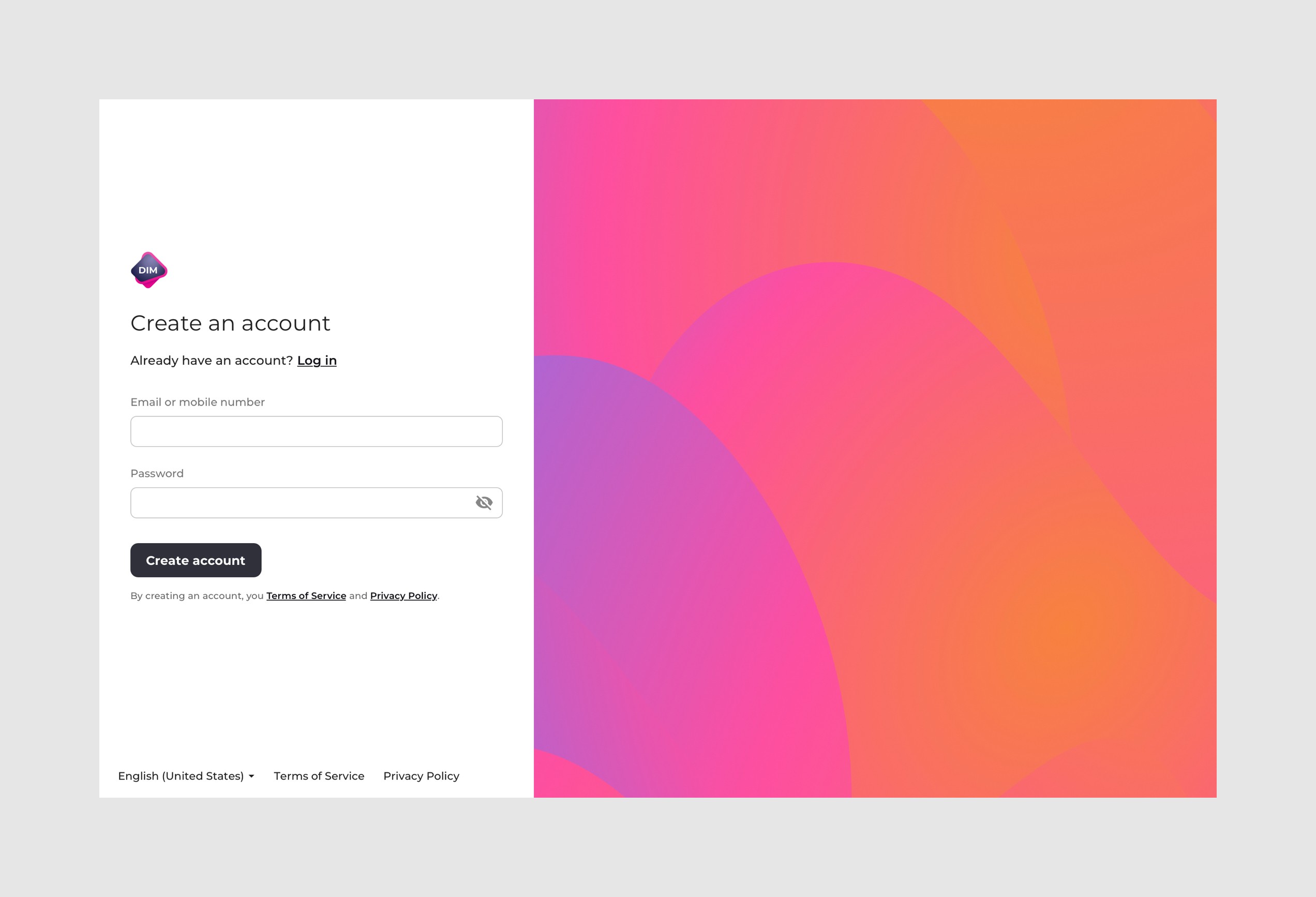
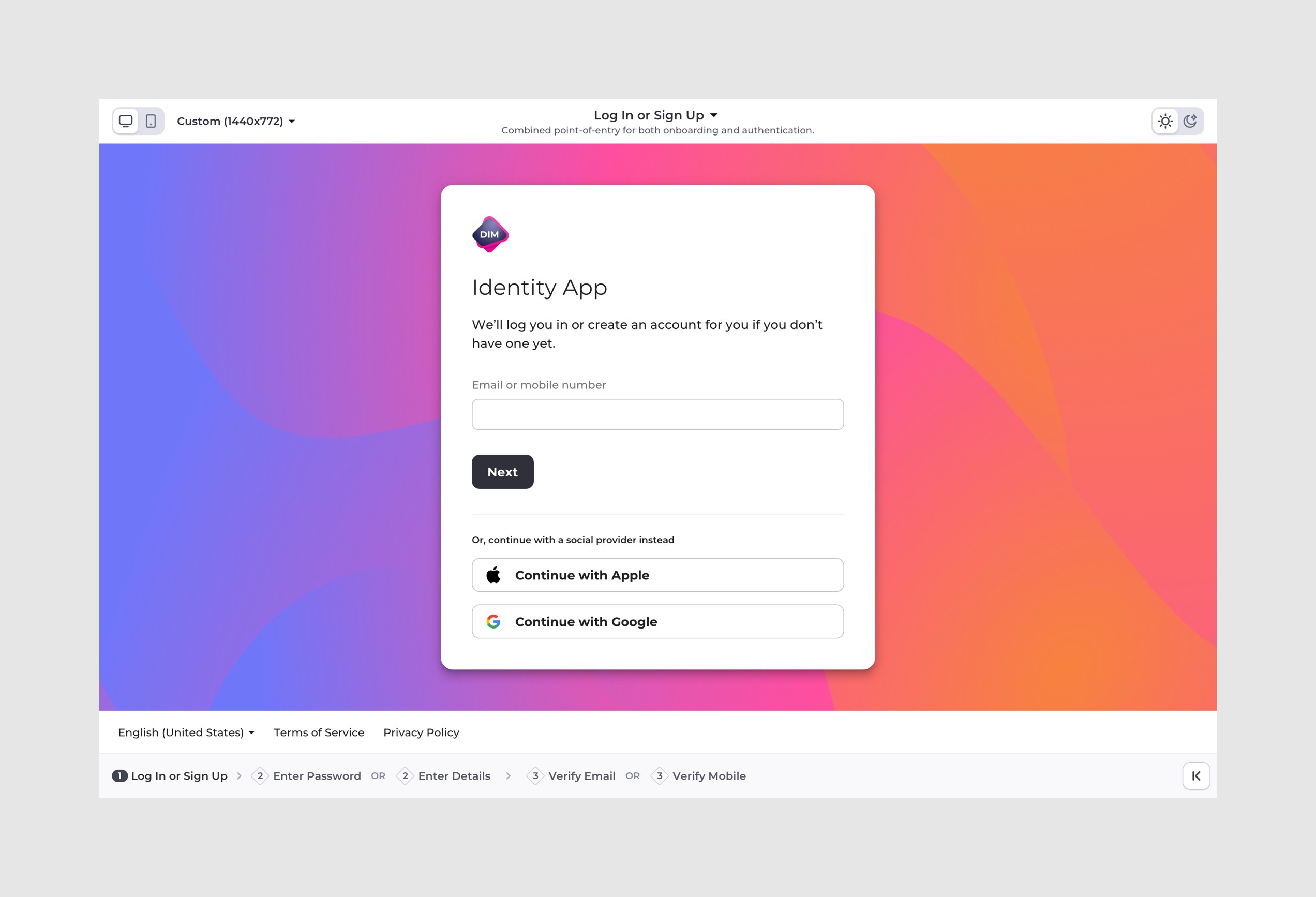
Onboarding & Authentication
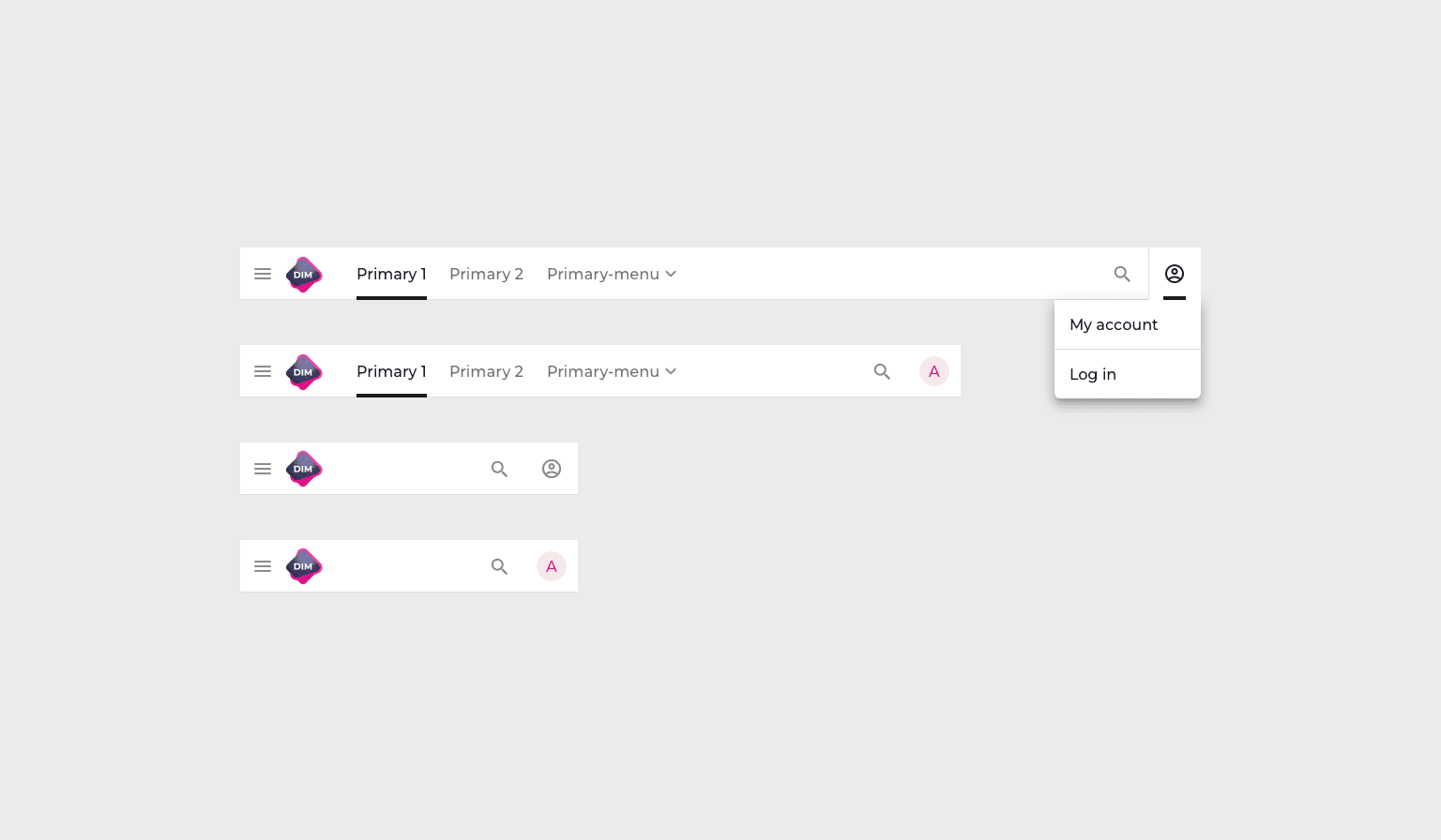
Customers had the choice of a combined point-of-entry for onboarding and authentication, or separate login and signup user flows, and when separated, could take place in a single step or mulltiple steps. These pages could be further customized with layout and background options, and adapted to features like single sign-on, MFA, social login, and more.


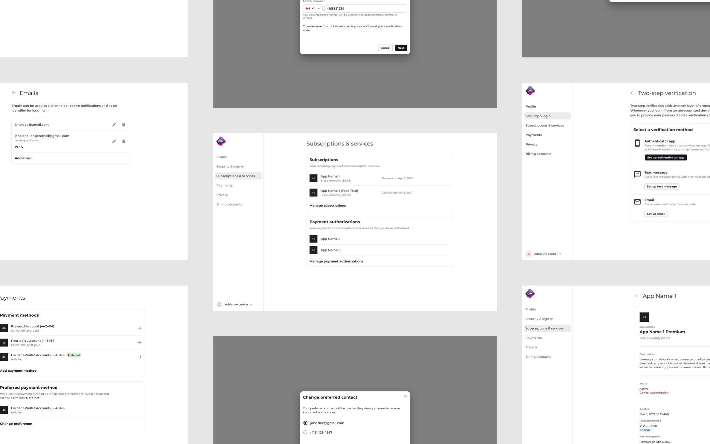
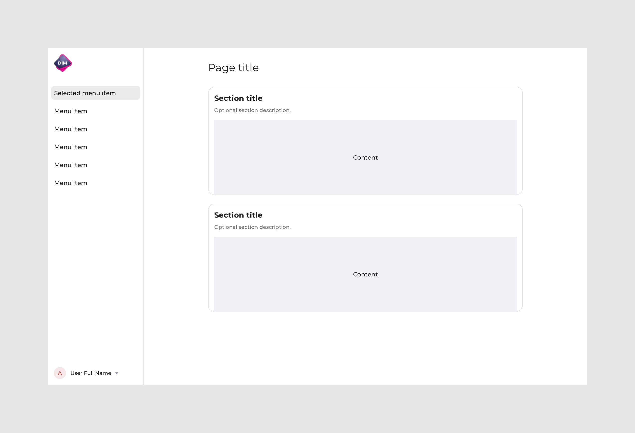
User management
This area allows authenticated users to manage different aspects of their digital identity.

Customizing the Identity App
Customers could configure settings, customize the style, and manage the theme of the Identity App from the Amdocs DIM Admin.
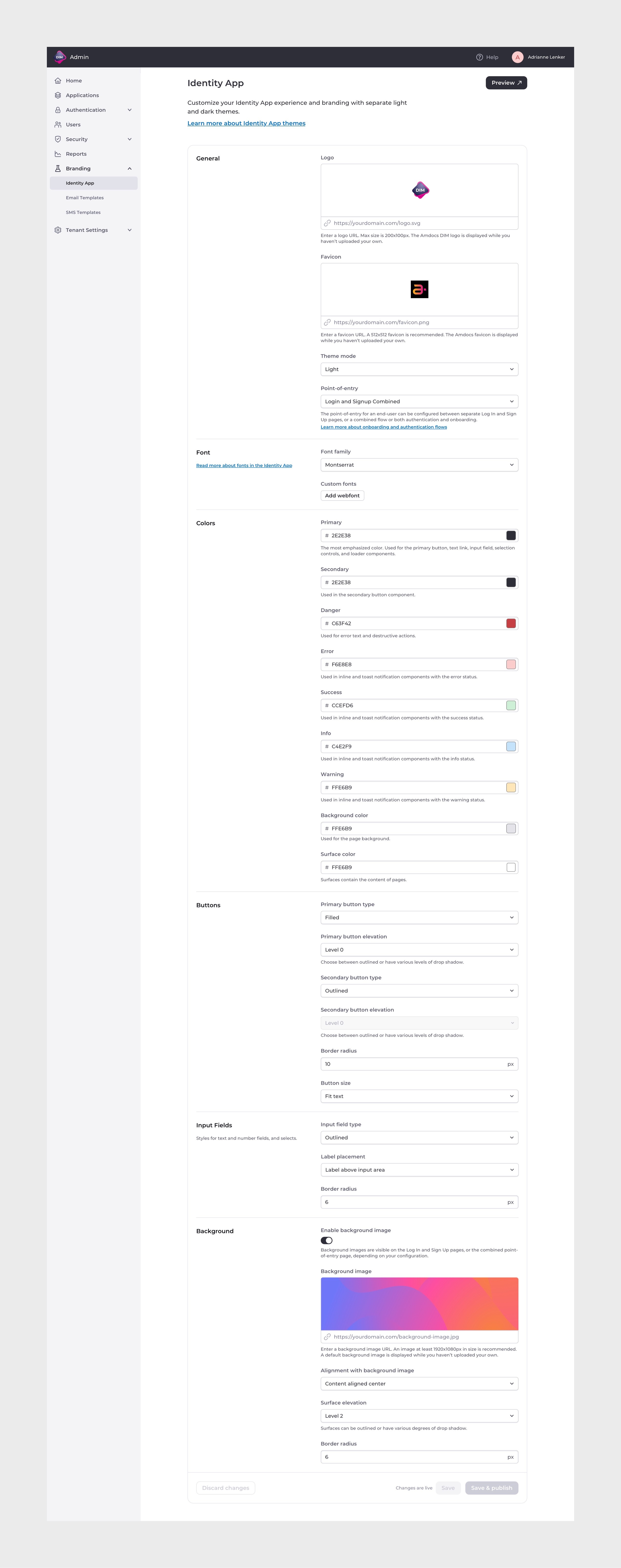
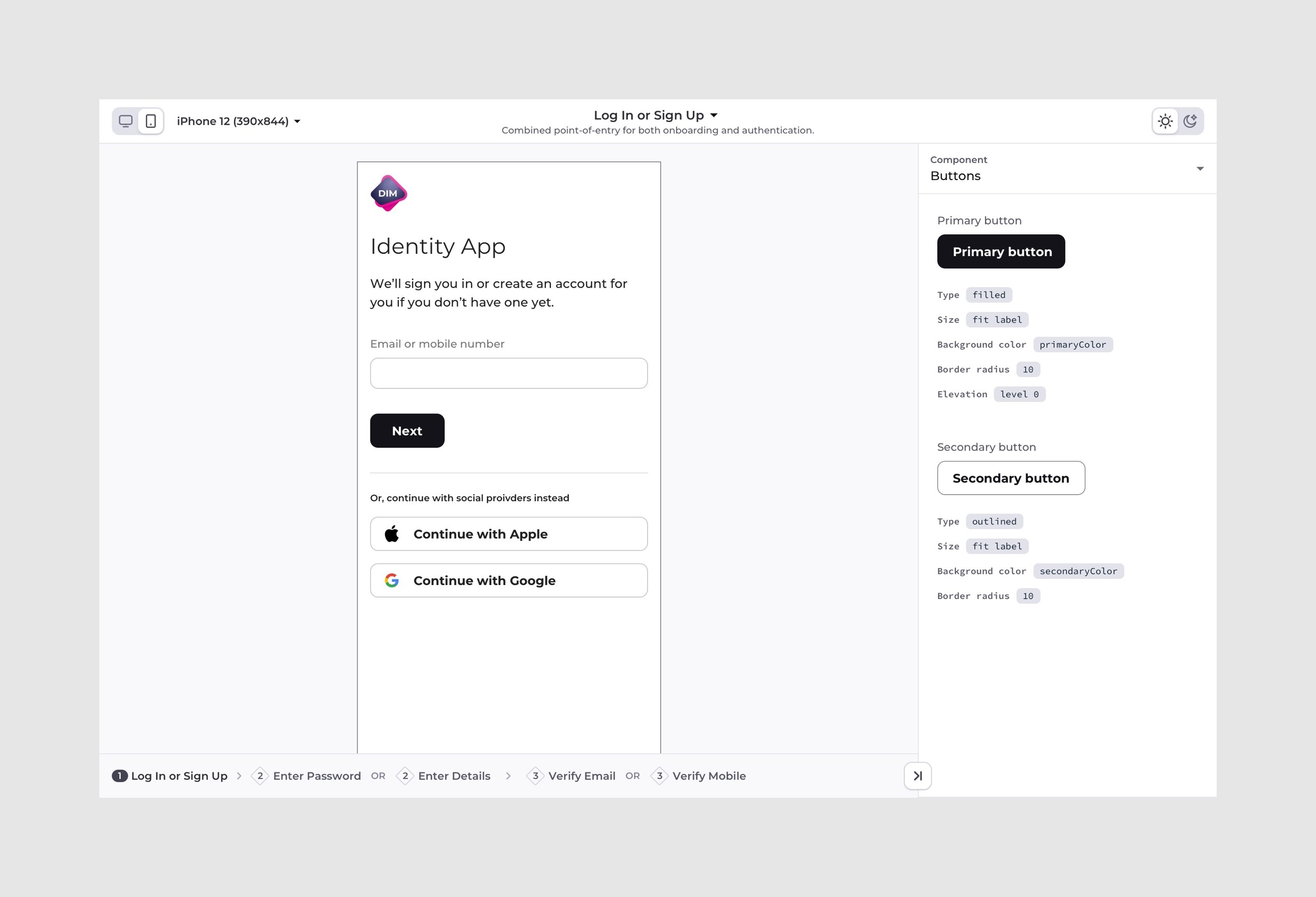
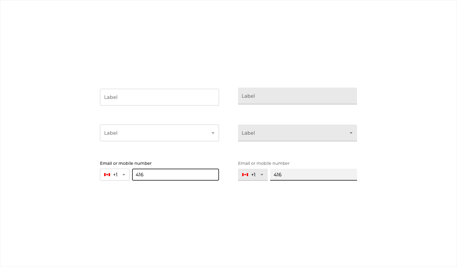
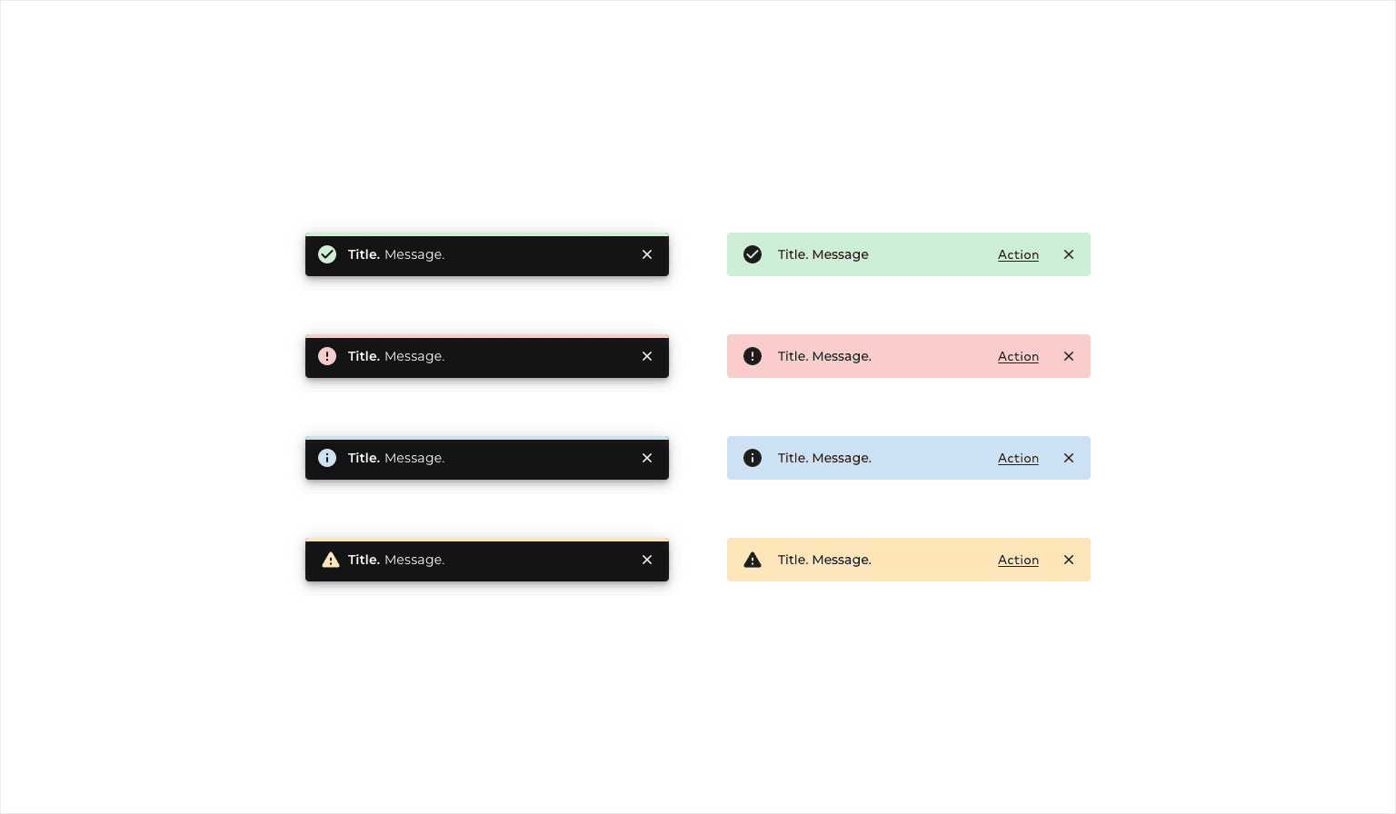
We leveraged Material UI-React because of its theming system and breadth of component options. Its text contrast features would also help to minimize legibility errors when customers were configuring themes. In some instances, we modified aspects of Material-UI or built on top of it to suit our needs, like by creating more robust Top Header and Notification components, and by creating a design pattern for destructive actions that utilized a Danger colour added to themes.
The design system featured page templates, components, and design patterns, built around dynamic themes.

Credits
Amin E
- Product Manager
Enan H
- Product Manager
Slava L - Dev Lead
Doowon L - Engineer
Herman S - Engineer
Ivan P - Engineer
Pushpinder V - Engineer
Sean C - Engineer
Riddhi P - Engineer
Tyler A - Engineer