Pantry
Bringing order to the kitchen

Pantry is an ongoing personal project I am designing and building in public. It's an app designed to bring order to the kitchen through meal planning, shopping lists, inventory management, and more.
Design System
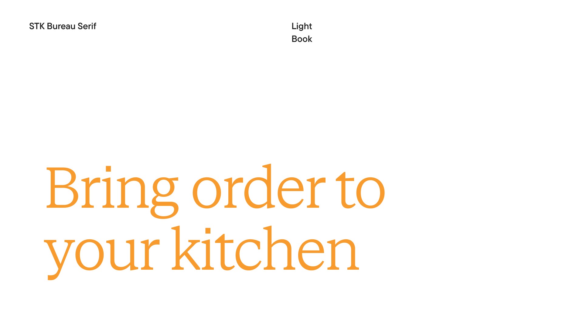
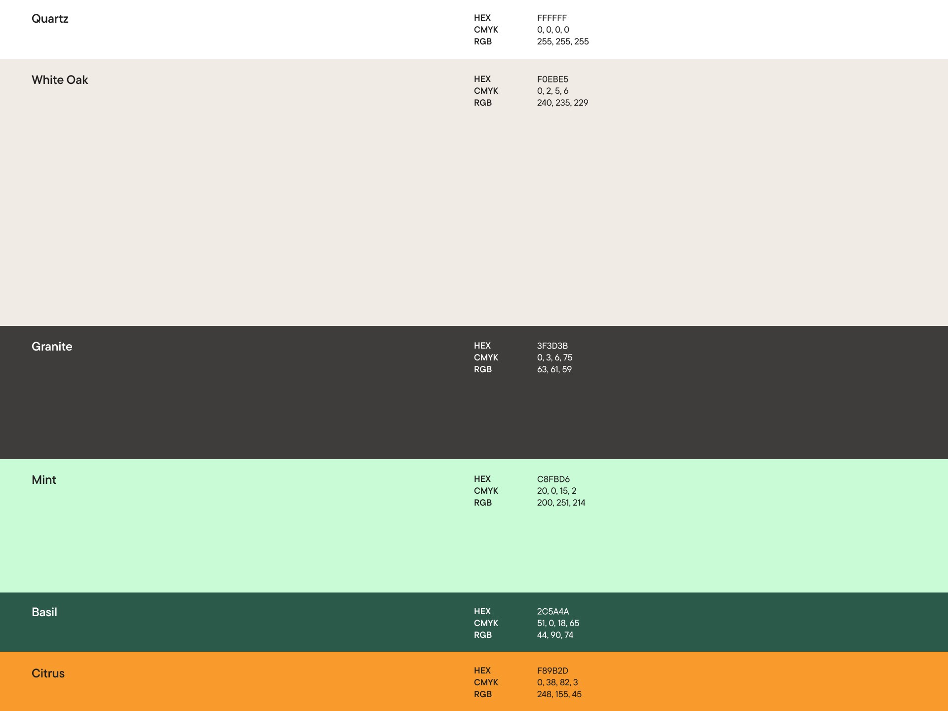
Visual Identity
Using produce and other ingredients in your home before they expire can feel like a race against the clock.
The idea for Pantry started when I wished I could receive notifications for food that was expiring, and have recipes suggested to me with ingredients I had at home.
After the seed was planted, and the idea grew, I searched the app store and beyond for similar apps and found a lot, but I was not discouraged. Though my idea was not novel, my mission became to create the best-designed app that would make these tasks as easy as possible, and a joy to use.
The fact that Pantry wouldn't be the first of its kind had its benefits — I could analyze existing apps and read reviews to find out where they fell short for some users. And so, I did just that. These learnings were useful when crafting the design principles and throughout the design process.
Key takeaways
Item categories that can be created and modified
Manageable Common Items and Saved Items
Items that include tags and an expiry date
Shopping lists that can be manually re-ordered
Functionality to print lists
Customizable Inventory lists
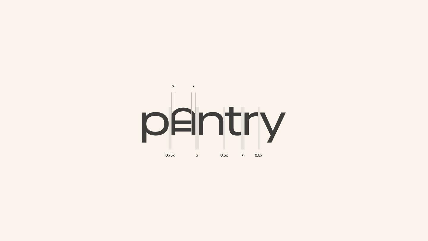
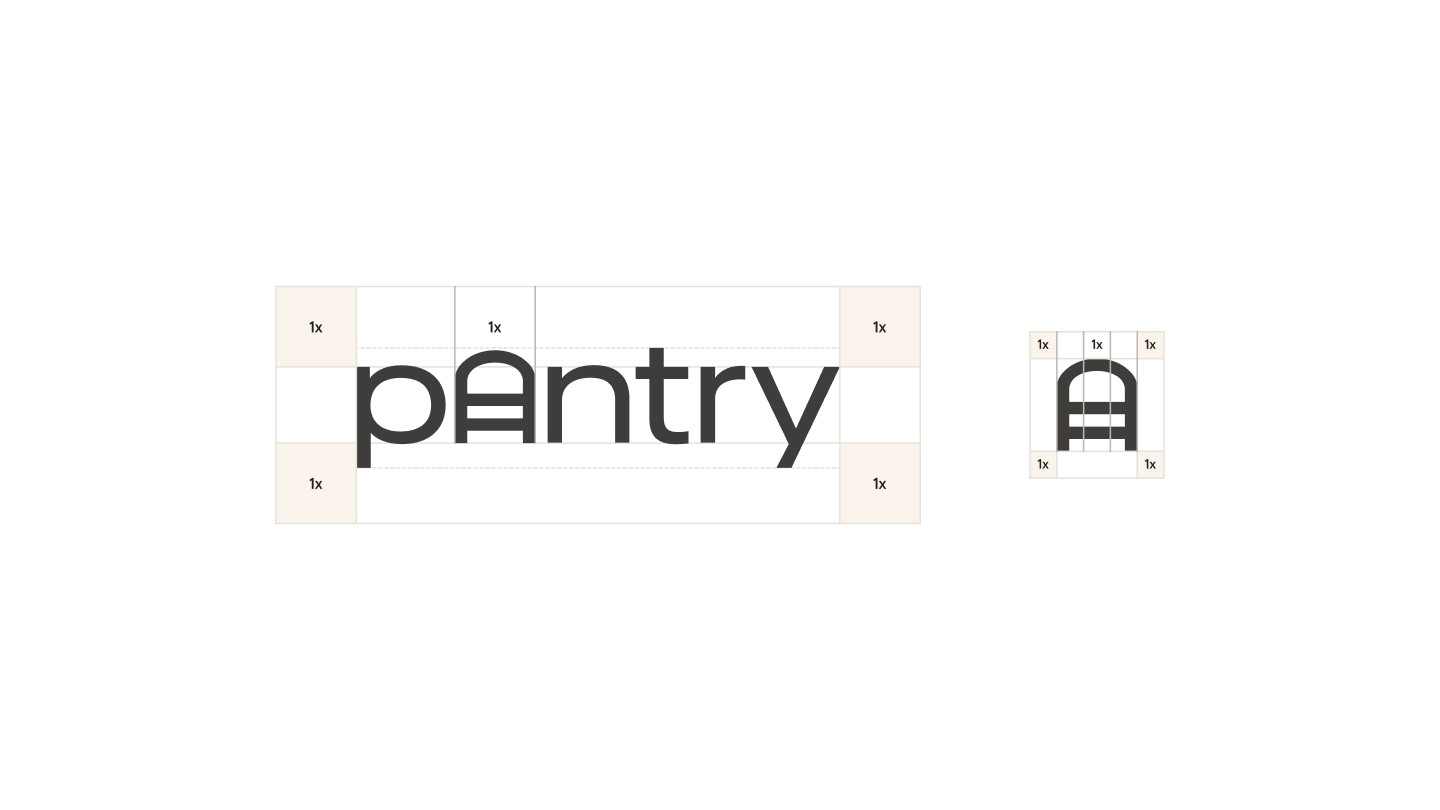
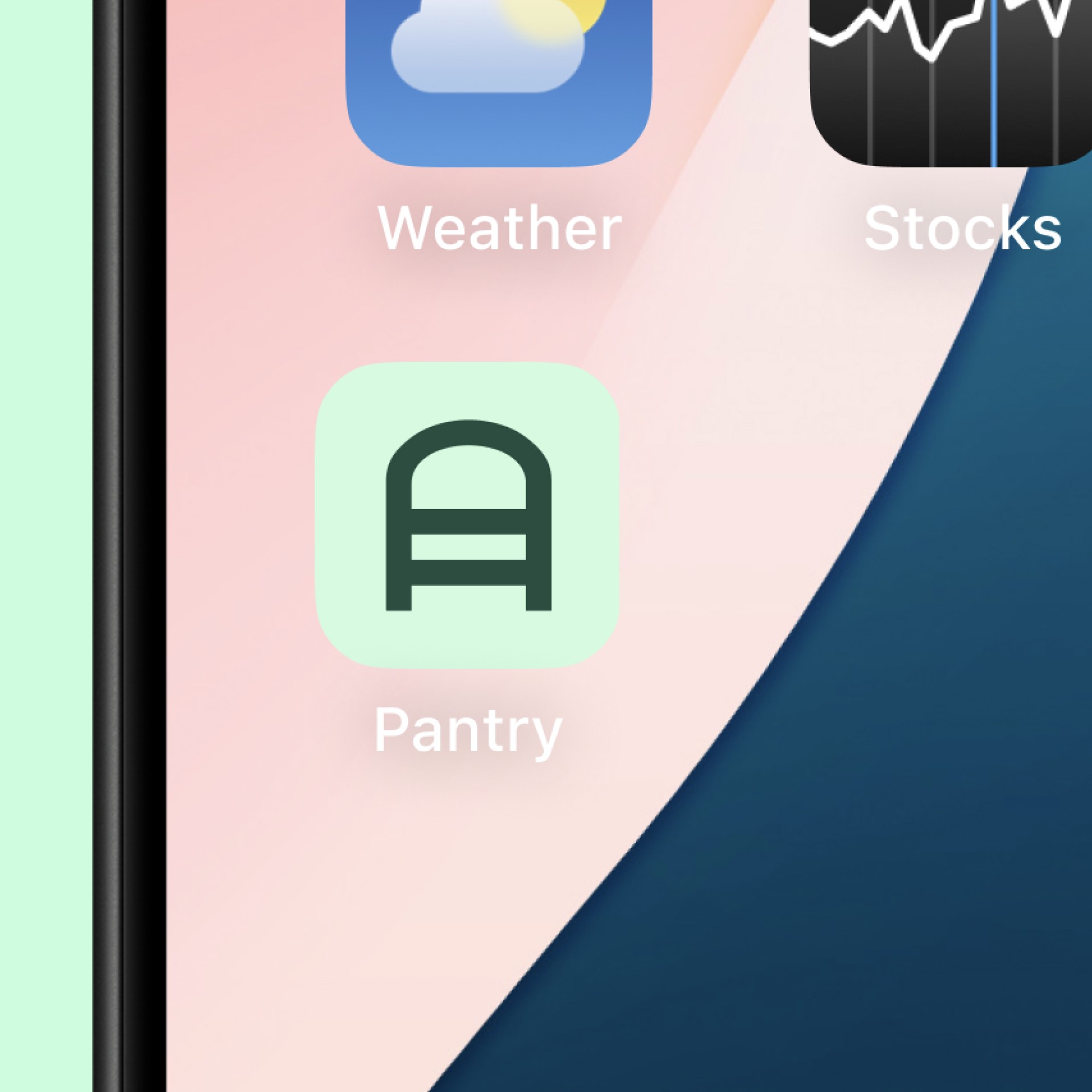
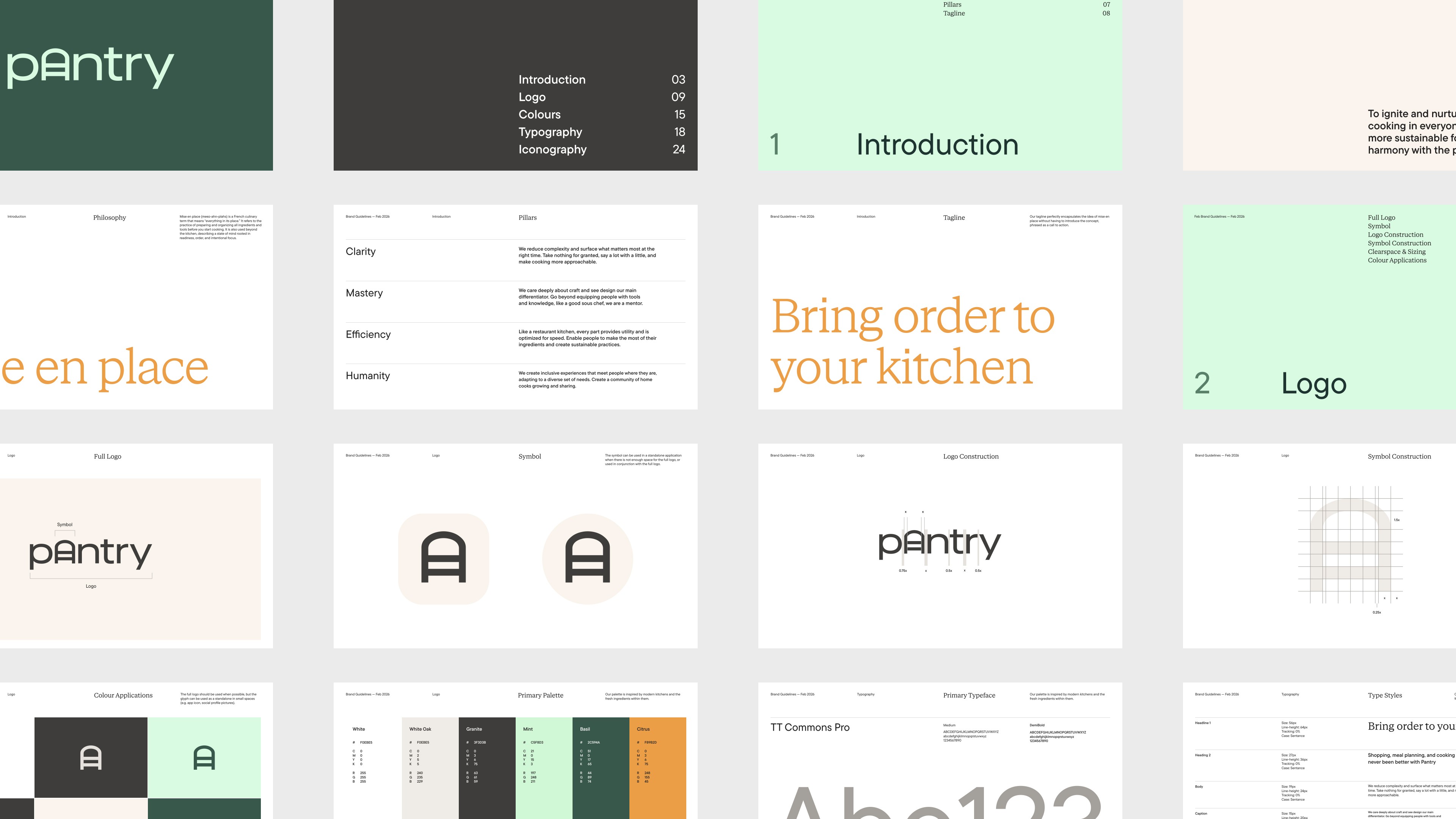
The brand aesthetic is inspired by modern kitchens. The wordmark includes the symbol which replaces the "a", but can also stand alone. Its shape emulates the curves found in the typeface, as well as the fun personality exuded by it.
I crafted a set of design principles at the beginning of the design process to guide my thinking.
Agility before detail
Enable users to accomplish tasks with the minimum amount input possible, and lean into simplicity.
Meet users where they are
The app should be configurable from a simple grocery list up to a fully-featured recipe app complete with inventory management.
No wasted time or effort
Use the data users' input to the maximum effect, and make it highly re-usable.
Plan
Plan meals with clarity around the ingredients you have at home and what you still need to pick up.

Keep track of food at home
Inventory is designed to manage what's at home, so you never make duplicate purchases again. Optionally keep track of your current stock, and plan meals with recipes centred around the ingredients you already have.


Enabling users to quickly add items
When adding items to your inventory or groceries list, you can instantly add previously added or create new products with smart defaults. Expiration Dates, Reminders, Priority, and Tags can be set for items that will be remembered if changed. Once an item is added, details can be viewed by tapping an item.


Lists optimized for recipes and groceries
Grocery lists are sorted by item category by default that can be re-ordered. Adding items to grocery lists utilizes the same design pattern as with Inventory, allowing for quick and familiar list creation. As items are checked-off, they are moved into a "Ready to Store" section that appears at the bottom of the list where items can then be added to Inventory.


Get creative with your ingredients
Create your own recipes and cookbooks, and easily add ingredients from recipes to your grocery list.


Roadmap
Settings/Help screen designs
Recipes features screen designs
Plan feature screen designs
Brand identity
Dark mode
iOS app assets
iOS 26 Liquid Glass designs
iOS Version 1 Swift UI development (Inventory, Shopping, and Settings)
Sharing feature development
Recipes feature development
Plan feature development
More